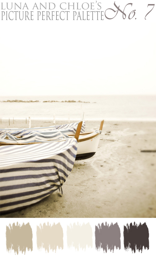
And I know it has been a while since my last PPP post, so I am hoping that this one makes up for it! So without further ado, here is PPP No. 7...
So let's just jump right into this first example of this palette, shall we? First up is some gorgeous outdoor event inspiration. Have a look-see at the fabulous curtains...
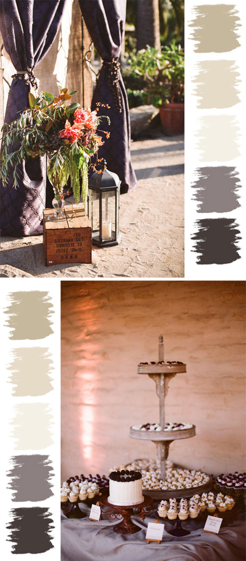
Up next is this homespun, homemade, vintage table...
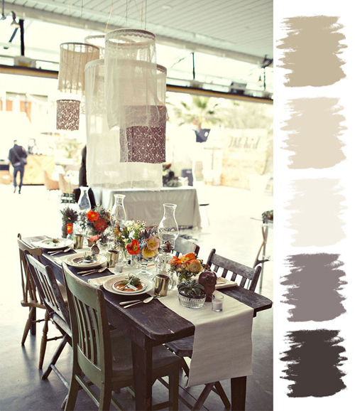
And moving on from a homespun, vintage style - lets go to the other end of the spectrum with some elegant winter inspired decor. Here the addition of deep, rich green is brought in, however, still in small batches...
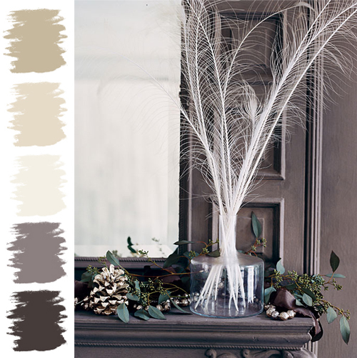
Eeks - I love the way it's used here too! Just picture charcoal linens, white plates, clear glass vases in a variety of sizes filled with white feathers as centerpieces. A couple of painted pine cones (a beigy metallic is what I am picturing) and greenery on the table mixed among the vase(s) on the table would add a natural but elegant look. Lots of candles on the table would complete the look. Yet, some silky ribbon (possibly tied around the napkin or wrapped around a menu card) in a deep, rich color would be a fabulous addition as well. Do you see it? Fabulous, no?
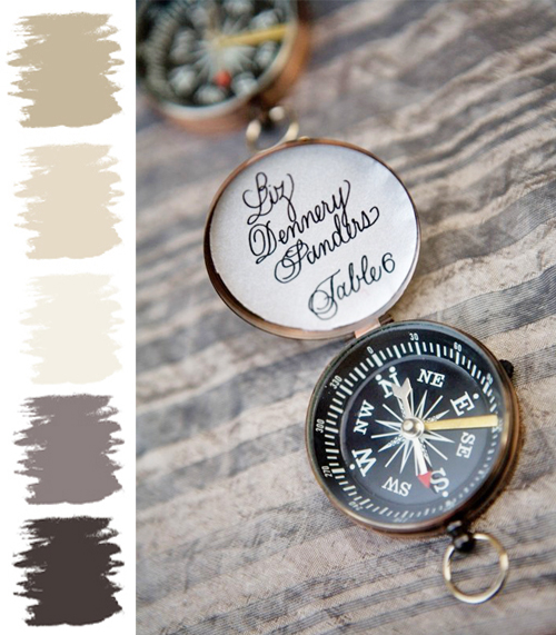
Ahh, so there you have it my dears - a Picture Perfect Palette! Hmm - that's one palette used four different ways, if you include the beach/compass inspiration...always amazing to see how you can incorporate it into any style of event. Goodness, I love doing these posts; hope you love them as well. Here's to a lovely weekend - may it be as fabulous as you! I'll see you Sunday.
~ Ciao
~ image via pretty stuff, image via lh calligraphy, photography by beaux arts photographie via style me pretty, image via 100 layer cake & domino


(haven't commented forever, sorry!) LOVE your finds, as always!!! Totally snagging the dessert setup for my wedding inspiration files! many hugs!
ReplyDeletehugs! Kim @ Love you better
I think this has to be my favorite perfect palette or until the next one goes up ;)
ReplyDeleteHave a great w/e Kristi!!
A perfect palette, indeed!
ReplyDeleteOh, and it looks like we're on the same color wavelength when it comes to palettes! We featured a navy blue/nautical palette today too :)
Happy Friday!!!
xo, chrissy.
Oh, the nautical love! I especially love those first two pics and the palette - so dreamy and preppy at the same time!
ReplyDeleteNot "bland and blah" AT ALL! So elegant and understated...and just lovely!
ReplyDeletei'm on a nautical kick too!... i just had a nautical themed wedding shoot TODAY! it was awesome, can't wait to share pics. :)
ReplyDelete