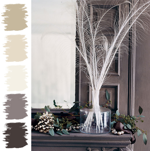
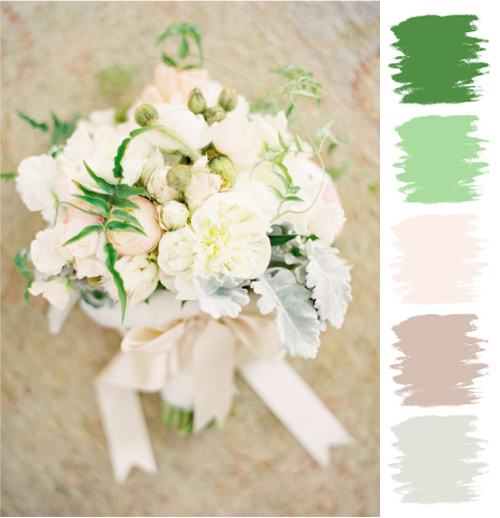
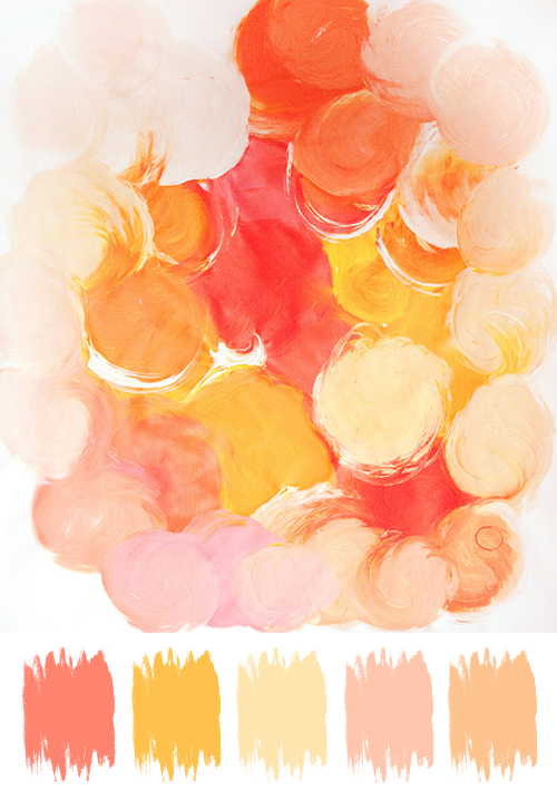
Good morning dearest darlings ;-) How about we start today off with a lovely palette? Yes. Fabulous. Then have a look-see at this 'Picture Perfect Palette'...
Gorgeous! A smashing palette for Spring and Summer. But I can't help but think that it would make a wonderful palette for a Winter wedding ;-) I know, not your typical Winter palette, however, it sure could be fun, no?
~ Ciao
...image via sunday in bed via look o on flickr
Showing posts with label Picture Perfect Palette. Show all posts
11.02.2011
10.24.2011
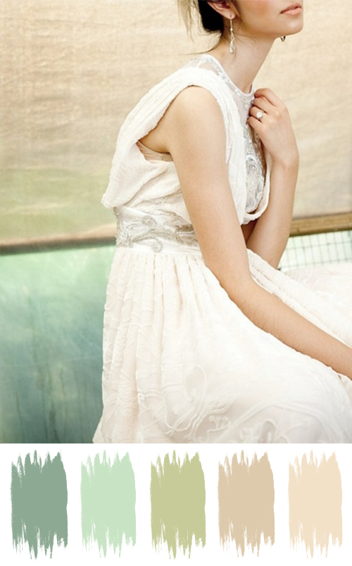
Picture Perfect Palette: A Wall
Hiya loves ;-))). Sorry, I'm running a bit behind schedule today! How about I try and make it up to you with a lovely palette? Sounds good, no? Then have a look-see at this...
So gorgeous, no? And I love that all the colors came from the wall - so lovely. But I gotta say, the dress is lovely too!
~ Ciao
...image via dustjacket attic
So gorgeous, no? And I love that all the colors came from the wall - so lovely. But I gotta say, the dress is lovely too!
~ Ciao
...image via dustjacket attic
6.24.2011
Picture Perfect Palette No. 7
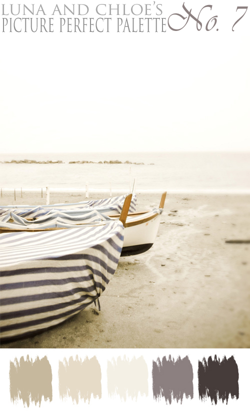
Yes, it's official...as determined on my previous post today - I'm on a nautical kick! So I am going to continue on that kick today with a beach inspired Picture Perfect Palette.
And I know it has been a while since my last PPP post, so I am hoping that this one makes up for it! So without further ado, here is PPP No. 7...
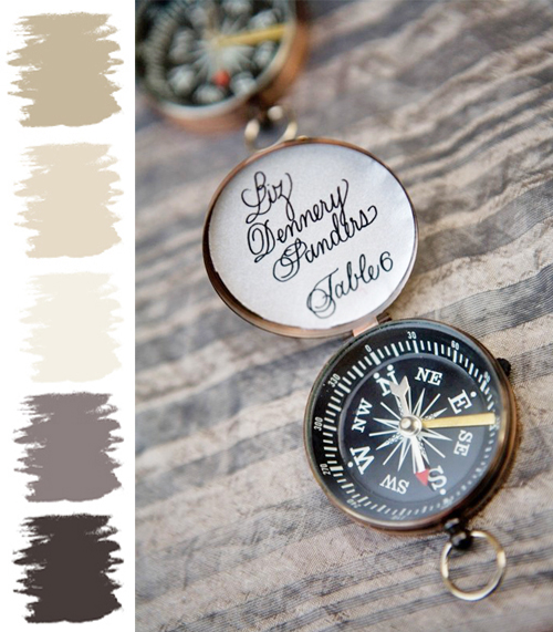
Such a pretty and calm palette. Tell me my previous 'Darling Detail' post of the compass escort cards wouldn't be perfect with this palette? Oh, I think it works perfectly...
And while I know this palette is too bland or blah for most people (however, I do LOVE it), it is a wonderful base for a color palette. By adding just one color to this palette, whether it be orange, green, yellow, etc...you can create a bunch of fabulous events.
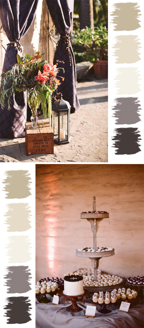
So let's just jump right into this first example of this palette, shall we? First up is some gorgeous outdoor event inspiration. Have a look-see at the fabulous curtains...
I love how the venue fits into this palette - from the sand/dirt floor to the fabulous walls. And by the addition of some gorgeous material set against the beige linen, it makes for quite a gorgeous backdrop. Carrying the color of the material over to the dessert table, it still keeps in line with the color palette. Don't the desserts fit perfectly with the palette as well?
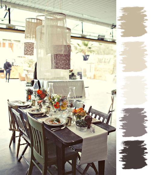
Up next is this homespun, homemade, vintage table...
I ADORE the look and feel of this decor. And look what the addition of just a hint of orange to this palette can create. Amazing, no?
And moving on from a homespun, vintage style - lets go to the other end of the spectrum with some elegant winter inspired decor. Here the addition of deep, rich green is brought in, however, still in small batches...
And I know it has been a while since my last PPP post, so I am hoping that this one makes up for it! So without further ado, here is PPP No. 7...
Such a pretty and calm palette. Tell me my previous 'Darling Detail' post of the compass escort cards wouldn't be perfect with this palette? Oh, I think it works perfectly...
And while I know this palette is too bland or blah for most people (however, I do LOVE it), it is a wonderful base for a color palette. By adding just one color to this palette, whether it be orange, green, yellow, etc...you can create a bunch of fabulous events.
So let's just jump right into this first example of this palette, shall we? First up is some gorgeous outdoor event inspiration. Have a look-see at the fabulous curtains...
I love how the venue fits into this palette - from the sand/dirt floor to the fabulous walls. And by the addition of some gorgeous material set against the beige linen, it makes for quite a gorgeous backdrop. Carrying the color of the material over to the dessert table, it still keeps in line with the color palette. Don't the desserts fit perfectly with the palette as well?
Up next is this homespun, homemade, vintage table...
I ADORE the look and feel of this decor. And look what the addition of just a hint of orange to this palette can create. Amazing, no?
And moving on from a homespun, vintage style - lets go to the other end of the spectrum with some elegant winter inspired decor. Here the addition of deep, rich green is brought in, however, still in small batches...
Eeks - I love the way it's used here too! Just picture charcoal linens, white plates, clear glass vases in a variety of sizes filled with white feathers as centerpieces. A couple of painted pine cones (a beigy metallic is what I am picturing) and greenery on the table mixed among the vase(s) on the table would add a natural but elegant look. Lots of candles on the table would complete the look. Yet, some silky ribbon (possibly tied around the napkin or wrapped around a menu card) in a deep, rich color would be a fabulous addition as well. Do you see it? Fabulous, no?
Ahh, so there you have it my dears - a Picture Perfect Palette! Hmm - that's one palette used four different ways, if you include the beach/compass inspiration...always amazing to see how you can incorporate it into any style of event. Goodness, I love doing these posts; hope you love them as well. Here's to a lovely weekend - may it be as fabulous as you! I'll see you Sunday.
~ Ciao
~ image via pretty stuff, image via lh calligraphy, photography by beaux arts photographie via style me pretty, image via 100 layer cake & domino
4.22.2011
Picture Perfect Palette No. 6
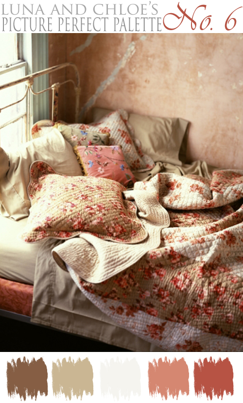
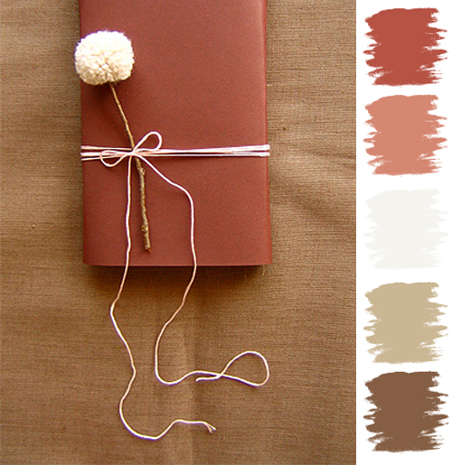
Good Morning lovelies. Happy Earth Day! In honor of Earth Day today, I thought I would choose a color palette that had lovely earth tones in it; while staying away from greens. So I was focused more on the actual earth. Soil to be exact. I was inspired by the brown sand of the desert and the pinkish red soil found in Arizona...and I found a fabulous picture that incorporated these colors in a very pretty way...
And finally, this would be a gorgeous palette for a classic and elegant event with a bit of whimsy...
Brown linen tablecloths, leather bound menus, and pom pom flowers add warmth, richness and whimsy, and would be oh so pretty! I would keep everything simple here - gorgeous glass vases in varying heigths with just one or two pom pom flowers in each would be elegant on long tables. Lots of glass, and candles and touches of leather would add to the elegance. Hmm, maybe strips of leather wrapped around the vases, or table numbers cut from leather...so many ways to incorporate pieces of leather here. I could also see escort cards made of leather with your guest names in gorgeous calligraphy on them. Oh yes, this palette would definitely work!
So my dears, what do you think of this palette for Earth Day? As always, would love to hear your thoughts or if any visions flashed in your head ;-) Stay tuned for another Easter wishes post coming up this afternoon. Until then, be happy...it's Friday!
~ Ciao
...photography by lisa hubbard, and images via la boom, sunday suppers & domestifluff via postcards and pretties
And I know exactly why I chose this picture...it's 1:22 a.m. and this is where I really want to be! However, I will be there soon enough...just after I finish typing this post ;-) Yet, I only have myself to blame for waiting until so late to do this post. It really is amazing how time slips by. It seemed like it was just 5:30 pm and I was on my walk, and then 9:00 pm and I finishing up playing a couple games of cards with Aunt Millie, and then I had to jump in the shower and wash my hair, etc... Now I understand why I always start working on these posts come Sunday - to have lots of time to put them together for you!
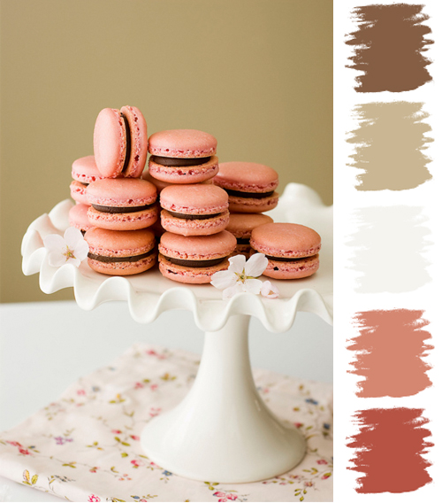
Anyhoo, I thought the above picture was so pretty, warm and welcoming...and of course makes a lovely palette for Earth Day today. Of course from the inspiration picture a vintage style wedding is perfect for this palette. One way to incorporate these colors into your event is in your desserts. You betcha your buttons I said desserts! Have a look-see at how fabulous these macarons work with this palette...
What I wouldn't give for a couple of those right now! A sugar rush is just what I need ;-) With a vintage style wedding and reception I would keep more with the browns and whites on the basics such as tablecloths, napkins, quilts, lace and doilies which would also bring in a variety of textures. I would bring in the color in the details - suitcases, vintage books, table numbers, and macarons on the dessert table of course. Picture frames filled with vintage fabrics that incorporate the palette would be wonderful details as well. You could use smaller ones on the table for table numbers, and larger ones to pin escort cards too.
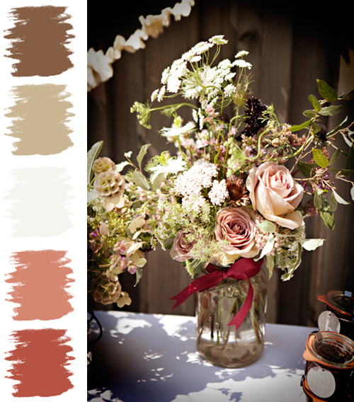
This palette also works for an outdoor, rustic/barn style as well...
I think if you took off the ribbon and added a bit of burlap instead it would look beautiful. Granted the ribbon works, I would just prefer it a bit more rustic. Arrangements like this on white linen tablecloths with a worn piece of wood running down the center of the table, or a burlap runner would look perfect. Some antlers would be a wonderful element to add as well. To bring in even more rustic details tie the napkins with some twine or rope and attach a place card if you'd like. Also, it would be cute to adorn the chair backs of the bride and groom with some simple rope and bunting flags. And I would love to see a cake on top of a wooden crate, wouldn't you?And finally, this would be a gorgeous palette for a classic and elegant event with a bit of whimsy...
Brown linen tablecloths, leather bound menus, and pom pom flowers add warmth, richness and whimsy, and would be oh so pretty! I would keep everything simple here - gorgeous glass vases in varying heigths with just one or two pom pom flowers in each would be elegant on long tables. Lots of glass, and candles and touches of leather would add to the elegance. Hmm, maybe strips of leather wrapped around the vases, or table numbers cut from leather...so many ways to incorporate pieces of leather here. I could also see escort cards made of leather with your guest names in gorgeous calligraphy on them. Oh yes, this palette would definitely work!
So my dears, what do you think of this palette for Earth Day? As always, would love to hear your thoughts or if any visions flashed in your head ;-) Stay tuned for another Easter wishes post coming up this afternoon. Until then, be happy...it's Friday!
~ Ciao
...photography by lisa hubbard, and images via la boom, sunday suppers & domestifluff via postcards and pretties
Labels:
Brown,
Earthy,
Natural,
Neutral,
Picture Perfect Palette
4.15.2011
Picture Perfect Palette No. 5
Hooray it's Friday! That alone outta make you happy. Well that is, if this Picture Perfect Palette (PPP) doesn't ;-) This week's PPP was inspired by my dear friend Chris, of the a.maz.ing blog Postcards and Pretties. You see, she has been inspiring me all week long with 'Picnic Week' on her blog! Click right here to have a look-see at all the pretty.
However, while I am so very ready for a picnic - the last couple of days here have felt more like Fall than Spring with the sun shining, but the air crisp and the breeze cold. So while I have been transported to pretty warm locales on Chris' blog each day this week, my reality here is bundling up a little more to fight off the chill. Hmm, I think I like being transported to warm and pretty better than reality!
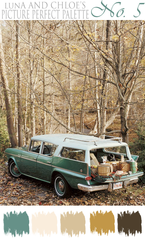
Anyway, since picnic and Fall like weather are on my mind I decide to use that inspiration in this week's PPP. I went through a handful of Chris' inspiration board to find one picture that I thought would make a perfect Fall picnic palette. Here is the picture I chose, with the palette...
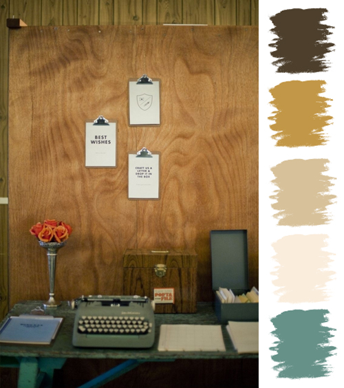
A Fall picnic in the woods sure does create a pretty palette, no? Lots of warm, rich browns and a pop of teal to add some color and interest. Oh, and yes, I would die to have a vintage station wagon in that color..did you see the rims are the same colors as the car? So fabulous! What fun it would be to take on my antiquing expeditions. I could find lots of fabulous things to fill it up with I'm sure. Okay, enough about the station wagon and onto this post.
Well this is a no brainer thanks to the inspiration picture, but this color palette works perfectly for a rustic ranch, cabin or barn style wedding. Yet, it doesn't have to be Fall to use these colors, a winter cabin wedding would look lovely too. However, I am picturing a rustic (horse) ranch in the Fall. And a great way to incorporate this color palette would be in some details...like wool blankets over hay bales for seating...
Or for your guests to wrap themselves up in for added warmth once the sun sets. For a winter wedding I can picture these wool blankets on the escort table, dinner tables or even the dessert table. Try picturing an invitation suite for a rustic ranch wedding in this palette...it would be so pretty with a horse or buck incorporated on it, would it not? I would keep the table decor in the neutral tones, and burlap would work well for a rustic ranch style. And keeping the table neutral would allow you to bring in pops of the teal in either the menu cards, napkins, favors at each seat, etc... I imagine a table full of wood rounds, branches or bark elements, cotton on it's branches, and lots of candles everywhere. Yes, it would look wonderful.
However, this palette looks fabulous for a classic and whimsy wedding style too...
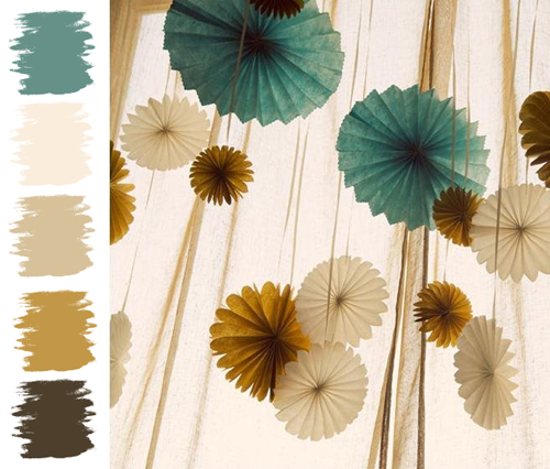
Ahhh, pinwheels are so dreamy and fun...I don't know if I will ever tire of them! For this style I would keep the table decor fairly plain and simple with everything pretty much in cream. I would add some cream flowers with greenery of course, and pull the teal in as table numbers, or small pinwheels at each place with the guests name on it, or ribbon wrapped around the napkin...small light touches is all you need to keep it classic with a bit of whimsy.
And don't think for one minute that you can't use this color palette for a glamorous feel! Just have a look-see at how lovely it could be...
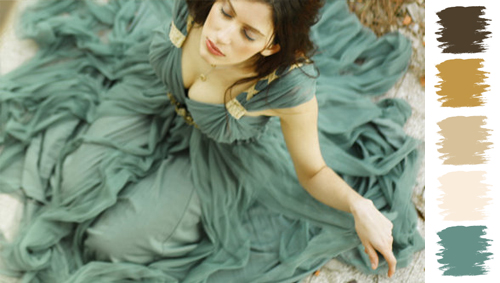
Eeks! Now I understand that you might not want to wear a colored wedding dress, however, this color would look stunning for bridesmaid dresses. Or you could always do creamy or beige dresses with teal wraps or shoes. To really make this palette glamorous stick with the beige, golden and teal colors...beige linens on the table, soft full creamy, maybe with a hint of pink, flower arrangements on the tables, golden accents is what is going to up the glamour here...so make sure to have lots of golden touches! And the wedding cake would look amazing on a gold stand or with gold accents on it, don't you think?
And finally, it looks pretty fabulous for vintage wedding too...
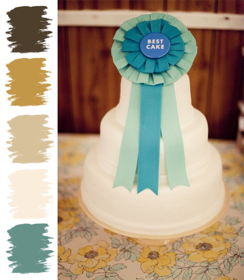
A vintage 4-H inspired theme, like the one above, is pretty fun and fabulous with this palette! I adore the Best Cake ribbon on their wedding cake. So many fun ways to incorporate this palette into a vintage wedding...like that station wagon in the inspiration picture!
I find it so very interesting that sometimes you see a palette and you think...hmmm, I like it but, it's not too exciting, or I'm not sure how this palette would work for a specific venue/theme/style, etc... Yet, once you start working with a palette it really starts to take a life of it's own. At first, I liked this palette - not loved, liked...I really, really liked it for a rustic ranch style wedding. However, after I started looking at images to work with that I have stored away, I found lots of different styles, and I really started to love the colors! So my dears...tell me, do you like or love it? And do you have a favorite style for this palette?
Hope you enjoyed this PPP post today! It's been a couple of weeks since my last one, and I so missed them. I promise to try and not let that much time go by again. Happy Friday my dears. I have one more post coming up for you later today...so I will see you again soon.
P.S. - Thank you bunches Chris for the inspiration!
~ Ciao
...image (1) via postcards and pretties via country living, (2) photography by sarah maingot, (3) photography by thayer allyson gowdy via a. hana design, (4) via lolinif and (5 & 6) photography by christine lim via ruffled
However, while I am so very ready for a picnic - the last couple of days here have felt more like Fall than Spring with the sun shining, but the air crisp and the breeze cold. So while I have been transported to pretty warm locales on Chris' blog each day this week, my reality here is bundling up a little more to fight off the chill. Hmm, I think I like being transported to warm and pretty better than reality!
Anyway, since picnic and Fall like weather are on my mind I decide to use that inspiration in this week's PPP. I went through a handful of Chris' inspiration board to find one picture that I thought would make a perfect Fall picnic palette. Here is the picture I chose, with the palette...
A Fall picnic in the woods sure does create a pretty palette, no? Lots of warm, rich browns and a pop of teal to add some color and interest. Oh, and yes, I would die to have a vintage station wagon in that color..did you see the rims are the same colors as the car? So fabulous! What fun it would be to take on my antiquing expeditions. I could find lots of fabulous things to fill it up with I'm sure. Okay, enough about the station wagon and onto this post.
Well this is a no brainer thanks to the inspiration picture, but this color palette works perfectly for a rustic ranch, cabin or barn style wedding. Yet, it doesn't have to be Fall to use these colors, a winter cabin wedding would look lovely too. However, I am picturing a rustic (horse) ranch in the Fall. And a great way to incorporate this color palette would be in some details...like wool blankets over hay bales for seating...
Or for your guests to wrap themselves up in for added warmth once the sun sets. For a winter wedding I can picture these wool blankets on the escort table, dinner tables or even the dessert table. Try picturing an invitation suite for a rustic ranch wedding in this palette...it would be so pretty with a horse or buck incorporated on it, would it not? I would keep the table decor in the neutral tones, and burlap would work well for a rustic ranch style. And keeping the table neutral would allow you to bring in pops of the teal in either the menu cards, napkins, favors at each seat, etc... I imagine a table full of wood rounds, branches or bark elements, cotton on it's branches, and lots of candles everywhere. Yes, it would look wonderful.
However, this palette looks fabulous for a classic and whimsy wedding style too...
Ahhh, pinwheels are so dreamy and fun...I don't know if I will ever tire of them! For this style I would keep the table decor fairly plain and simple with everything pretty much in cream. I would add some cream flowers with greenery of course, and pull the teal in as table numbers, or small pinwheels at each place with the guests name on it, or ribbon wrapped around the napkin...small light touches is all you need to keep it classic with a bit of whimsy.
And don't think for one minute that you can't use this color palette for a glamorous feel! Just have a look-see at how lovely it could be...
Eeks! Now I understand that you might not want to wear a colored wedding dress, however, this color would look stunning for bridesmaid dresses. Or you could always do creamy or beige dresses with teal wraps or shoes. To really make this palette glamorous stick with the beige, golden and teal colors...beige linens on the table, soft full creamy, maybe with a hint of pink, flower arrangements on the tables, golden accents is what is going to up the glamour here...so make sure to have lots of golden touches! And the wedding cake would look amazing on a gold stand or with gold accents on it, don't you think?
And finally, it looks pretty fabulous for vintage wedding too...
A vintage 4-H inspired theme, like the one above, is pretty fun and fabulous with this palette! I adore the Best Cake ribbon on their wedding cake. So many fun ways to incorporate this palette into a vintage wedding...like that station wagon in the inspiration picture!
I find it so very interesting that sometimes you see a palette and you think...hmmm, I like it but, it's not too exciting, or I'm not sure how this palette would work for a specific venue/theme/style, etc... Yet, once you start working with a palette it really starts to take a life of it's own. At first, I liked this palette - not loved, liked...I really, really liked it for a rustic ranch style wedding. However, after I started looking at images to work with that I have stored away, I found lots of different styles, and I really started to love the colors! So my dears...tell me, do you like or love it? And do you have a favorite style for this palette?
Hope you enjoyed this PPP post today! It's been a couple of weeks since my last one, and I so missed them. I promise to try and not let that much time go by again. Happy Friday my dears. I have one more post coming up for you later today...so I will see you again soon.
P.S. - Thank you bunches Chris for the inspiration!
~ Ciao
...image (1) via postcards and pretties via country living, (2) photography by sarah maingot, (3) photography by thayer allyson gowdy via a. hana design, (4) via lolinif and (5 & 6) photography by christine lim via ruffled
Labels:
Brown,
Classic,
Glamorous,
Gold,
Natural,
Neutral,
Picture Perfect Palette,
Rustic,
Rustic Ranch,
Teal,
Vintage,
Wedding Styles,
Whimsy
3.11.2011
Picture Perfect Palette No. 4
Yippee it's Friday! I am so excited that this week is over, as it has been a roller coaster of a week. And as much as I like riding on roller coasters at theme parks, I really do not care riding them in life...if that makes any sense. I try very hard not to complain, but I can definitely say that I am happy this week is over...that's not complaining is it? However, it makes me ever the more thankful for the majority of my weeks that are, besides crazy and busy, not roller coaster rides ;-)
So for this week's PPP I was really in the mood for some soft and mellow colors - obviously very much my style. Even though this is a soft palette once again, wait to you see the fabulous styles you can create with it. They were so good I had to include two pictures for each! And don't get me wrong...I love color, but after a week like this it's the softer palettes that appeal to me. Yet, fret not as I have some very colorful inspiration planned for next week's PPP.
Anyhoo - moving on, here is your PPP for this week...
But wait - the goodness doesn't stop there! Oh no, this french outdoor style really is amazing with this palette too...
And oh my goodness a cheese and bread table - heaven in my world! While the pale grey-blue doesn't play a very prominent role in this style, it can easily be brought in with some linens or flowers. Not that you have to include every color, but you could easily incorporate it. However, the Roquefort and Stilton (not included in this picture, but was in the photo shoot) cheese brings in hints of the grey-blue, and the shadows that are cast from the 150 year old trees above do give the white cake plates a grey-blue hue. Nonetheless, this palette is still gorgeous for french outdoor inspiration.
One palette used for three different styles, but all still perfect in there own way. So tell me loves...do you like one of the styles best for this palette? Would love to hear your thoughts. Oh, and I have to tell you - this palette is perfect for the beach too.
~ Ciao
So for this week's PPP I was really in the mood for some soft and mellow colors - obviously very much my style. Even though this is a soft palette once again, wait to you see the fabulous styles you can create with it. They were so good I had to include two pictures for each! And don't get me wrong...I love color, but after a week like this it's the softer palettes that appeal to me. Yet, fret not as I have some very colorful inspiration planned for next week's PPP.
Anyhoo - moving on, here is your PPP for this week...
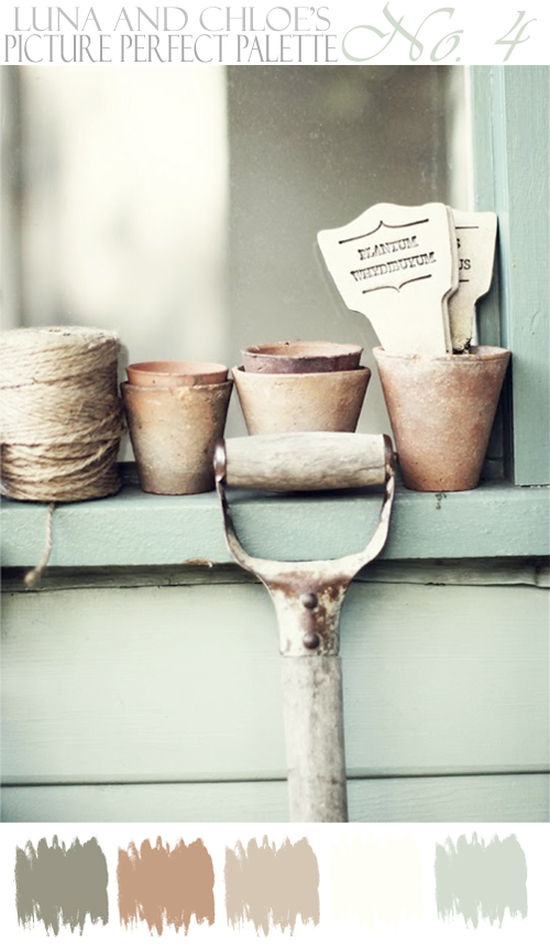
Hmmm, no wonder I like this now that I think about it - a cottage garden is serene and calming, which makes total sense why I chose it for this week. This palette works beautifully with the style. I love the faded and worn terra cotta pots and they would be perfect for centerpieces of white garden roses. I can picture wooden tables with a creamy table runner, doilies or vintage linens, the pale grey-blue would be brought in on napkins with twine keeping them rolled, and I would use the markers as escort cards in an old wooden crate. Quite lovely, no?
However, this palette is amazing for a woodsy organic style...
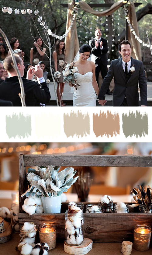
Did I not tell you? Oh these colors are perfection with this decor. How fabulous is the pale grey-blue that is incorporated in the brides bouquet and on the tables. The bridesmaids dresses are just the perfect match too. All the wood brings in the browns and the grey. Twine is an element as well for this style and looks wonderful wrapped around jars filled with candles. Not a lot of color, but tons of impact! And I love that, as it is quite unexpected.But wait - the goodness doesn't stop there! Oh no, this french outdoor style really is amazing with this palette too...
And oh my goodness a cheese and bread table - heaven in my world! While the pale grey-blue doesn't play a very prominent role in this style, it can easily be brought in with some linens or flowers. Not that you have to include every color, but you could easily incorporate it. However, the Roquefort and Stilton (not included in this picture, but was in the photo shoot) cheese brings in hints of the grey-blue, and the shadows that are cast from the 150 year old trees above do give the white cake plates a grey-blue hue. Nonetheless, this palette is still gorgeous for french outdoor inspiration.
One palette used for three different styles, but all still perfect in there own way. So tell me loves...do you like one of the styles best for this palette? Would love to hear your thoughts. Oh, and I have to tell you - this palette is perfect for the beach too.
~ Ciao
...image 1 via a cottage in the woods , 2 & 3 photography by jasmine star via green wedding shoes & 4 & 5 photography by michael and anna costa via style me pretty
3.04.2011
Picture Perfect Palette No. 3
Happy Friday my dears! I have to tell you that I have been having so much fun putting the PPP posts together for you. It's really fabulous to find a palette that works with a variety of wedding styles.
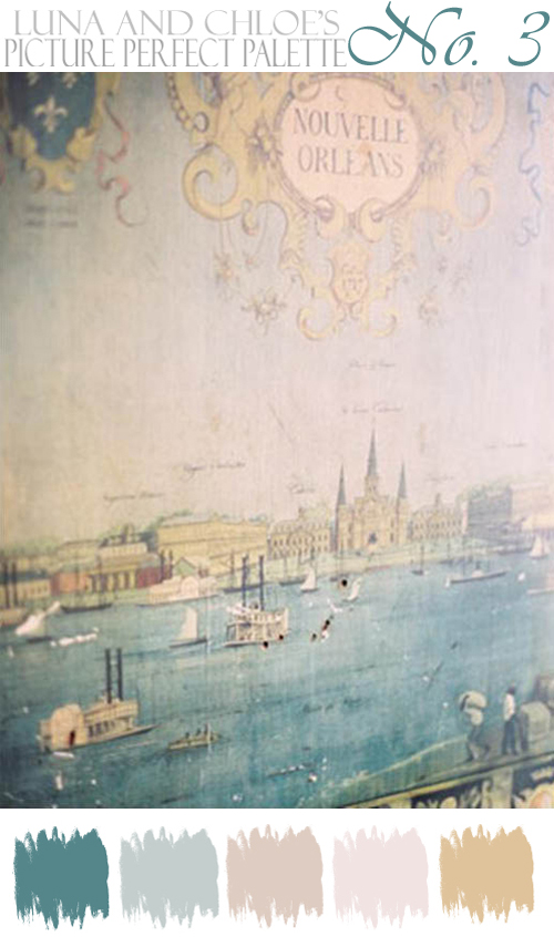
For this week's PPP we are heading to the French Quarter for some gorgeous inspiration...
I love this old world picture of New Orleans, and knew it would make for one gorgeous palette. How fabulous is the flourish at the top? I can just picture a wedding with an old world feel in the french quarter in these warm soft shades. Of course I think a little flourish or glamour should be brought in with some gold details, and I am thinking a gold masquerade mask for the bride would be a wonderful touch! A masquerade wedding would be so fun, no?
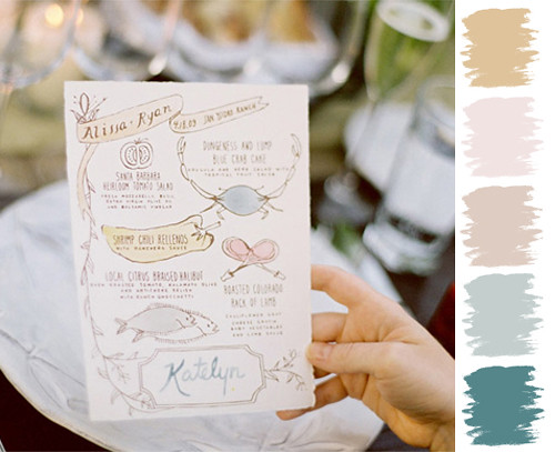
However, this palette works so well with a classic/elegant style wedding with a bit of whimsy too! I know, I just posted this picture on Wednesday, but when I started working on this post I realized that it works perfectly. No wonder I loved this picture...
I love how the whimsy menu card brings in the colors from the palette. Proof, yet again, that this is a fabulous palette to work with.
And this color palette is perfect for a rustic or barn style wedding too. The galvanized tin pails are just the perfect color for this palette. Soft, pale flowers flowing out of tin pails as centerpieces would be wonderful. By adding some burlap or linen and worn wood you would have the main elements that are needed. However, I would love to see a little sparkle (or flourish) brought in with a gorgeous chandelier, wouldn't you? I always love an unexpected element.
There you have it my dears - one palette used in three totally different styles! So tell me - do you have a favorite?
~ Ciao
...images via style me pretty
For this week's PPP we are heading to the French Quarter for some gorgeous inspiration...
I love this old world picture of New Orleans, and knew it would make for one gorgeous palette. How fabulous is the flourish at the top? I can just picture a wedding with an old world feel in the french quarter in these warm soft shades. Of course I think a little flourish or glamour should be brought in with some gold details, and I am thinking a gold masquerade mask for the bride would be a wonderful touch! A masquerade wedding would be so fun, no?
However, this palette works so well with a classic/elegant style wedding with a bit of whimsy too! I know, I just posted this picture on Wednesday, but when I started working on this post I realized that it works perfectly. No wonder I loved this picture...
I love how the whimsy menu card brings in the colors from the palette. Proof, yet again, that this is a fabulous palette to work with.
And this color palette is perfect for a rustic or barn style wedding too. The galvanized tin pails are just the perfect color for this palette. Soft, pale flowers flowing out of tin pails as centerpieces would be wonderful. By adding some burlap or linen and worn wood you would have the main elements that are needed. However, I would love to see a little sparkle (or flourish) brought in with a gorgeous chandelier, wouldn't you? I always love an unexpected element.
There you have it my dears - one palette used in three totally different styles! So tell me - do you have a favorite?
~ Ciao
...images via style me pretty
2.25.2011
Picture Perfect Palette No. 2
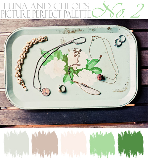
Oh do I have a pretty palette for you today...
I would love to hear what you came up with! So what do you think? Is there a style that you like the best?
Pretty, pretty, no? Such a fabulous palette for a vintage rustic soiree. It's clear that these colors make a perfect palette for this style.
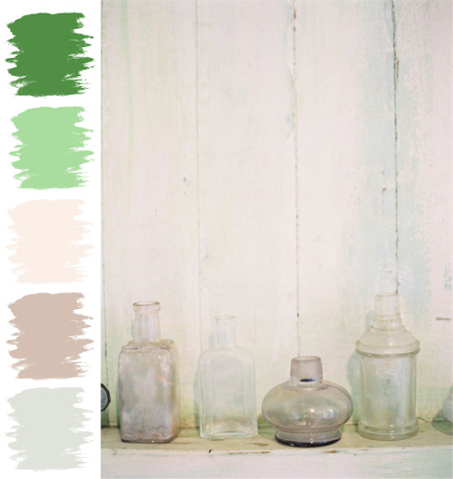
However, I would love to see this palette at a vintage beach wedding. Here is just one way you could incorporate some of the palette's colors...
Pretty vintage glass bottles - a couple that I would fill with a simple flower or greenery, and the rest I would leave as is - empty. Vintage bottles are a wonderful detail to use at a beach wedding...it's as if they might have been just washed up onto the beach. Hmmm, wonder if there was a message inside, don't you? And speaking of that - I would roll up the menus (would love them on worn, vintage paper) or maybe a thank you note, tie them with twine and place at each setting...it would have to be done just right though so it didn't looking cliche. Another detail that I would add would be soft, washed linens on the table, and maybe some vintage doilies.
And of course, this palette would be perfect for a classic, romantic, or an elegant garden wedding too. This bouquet is a fabulous example of just how perfect it would be...
Flowers would be flowing out of their silver or gold vessels, the chandeliers would be hung (from trees, if outdoors), and lots of candles everywhere...is a good start, but I'll let your imaginations take it from there.I would love to hear what you came up with! So what do you think? Is there a style that you like the best?
~ Ciao
2.18.2011
New Series: Picture Perfect Palette
Do you ever see a picture and think that the colors in it would make the perfect palette? Eek, I do it all the time! So I thought, why not introduce a new color series to LCW doing just that. One of the big decisions a bride has to make fairly early on is...what color(s) they want to have at their wedding. I am hoping that this new series will show you lots of different color palette options to choose from.
I know that I could create inspiration boards for you, but I decided I am going to leave that up to my two fabulous friends, Chris of Postcards and Pretties and Kate of Magnolia Rouge and Ruby and Willow who create the most A.MAZ.ING boards out there! However, just to mix things up, you will see some added inspiration in the form of color, not necessarily the feel of the image or style...but the color, and how if you love the colors you can incorporate them into your event no matter the style or theme.
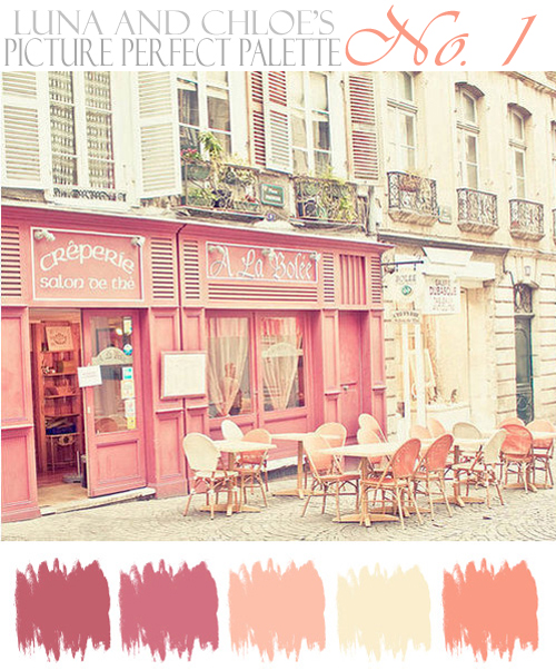
So without further ado, the first Picture Perfect Palette...
I am loving the colors in this picture; soft with creamy undertones. They conjure up images of an ivory wedding dress, pink bridesmaids dresses and flowers with just a hint of the two darker shades. I would add in pops of melon for contrast.
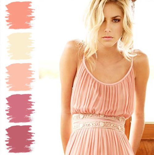
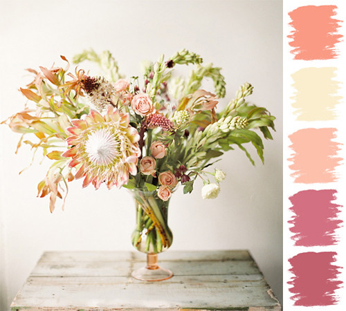
The wonderful thing about seeing a color palette is that you don't have to necessarily choose all the colors. For me the soft pink, creamy vanilla and melon would be the colors I would choose (go figure), with the darker colors brought in here and there. And just to give you a little idea on how you could incorporate these colors, I found two examples for you - one being a bridesmaid dress...
I am adoring all the pleats on this dress! It's a perfect match for the soft pink and brings in the vanilla in the sash detail. And the second is flowers...
As for the flowers (yeah, I know...you have seen them before ;-)), I adore the pink and hint of vanilla...yet, if you look closely those berries and the small darker flowers pick up the two darker colors in this palette.
And if this color palette isn't working for you, check back next week for a new one! I would love to hear your thoughts on this new series. Any suggestions would be greatly appreciated ;-) I thought about giving the colors names, but couldn't decide. Anyhow, hope you enjoyed this post!
~ Ciao
I know that I could create inspiration boards for you, but I decided I am going to leave that up to my two fabulous friends, Chris of Postcards and Pretties and Kate of Magnolia Rouge and Ruby and Willow who create the most A.MAZ.ING boards out there! However, just to mix things up, you will see some added inspiration in the form of color, not necessarily the feel of the image or style...but the color, and how if you love the colors you can incorporate them into your event no matter the style or theme.
So without further ado, the first Picture Perfect Palette...
I am loving the colors in this picture; soft with creamy undertones. They conjure up images of an ivory wedding dress, pink bridesmaids dresses and flowers with just a hint of the two darker shades. I would add in pops of melon for contrast.
The wonderful thing about seeing a color palette is that you don't have to necessarily choose all the colors. For me the soft pink, creamy vanilla and melon would be the colors I would choose (go figure), with the darker colors brought in here and there. And just to give you a little idea on how you could incorporate these colors, I found two examples for you - one being a bridesmaid dress...
I am adoring all the pleats on this dress! It's a perfect match for the soft pink and brings in the vanilla in the sash detail. And the second is flowers...
As for the flowers (yeah, I know...you have seen them before ;-)), I adore the pink and hint of vanilla...yet, if you look closely those berries and the small darker flowers pick up the two darker colors in this palette.
And if this color palette isn't working for you, check back next week for a new one! I would love to hear your thoughts on this new series. Any suggestions would be greatly appreciated ;-) I thought about giving the colors names, but couldn't decide. Anyhow, hope you enjoyed this post!
~ Ciao
...images via the alternative wife, rose and ruby, and once wed with photography by jose villa
Labels:
Cream,
Mauve,
Melon,
Picture Perfect Palette,
Pink
Subscribe to:
Posts (Atom)